Responsive Web Design
Responsive Web Design
Responsive web design is creating a website that allows easy navigation and reading by using grids instead of units like pixels. It's become so important because mobile traffic makes up more than of of the total internet traffic. Media queries are a CSS3 module letting content adapt to the size of the screen and things such as screen resolution. Breakpoints are the point where the site will respond to the user with the best layout for content. |

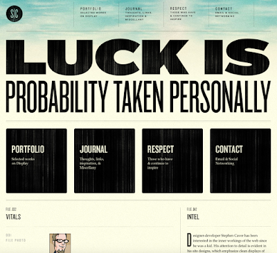
Here is the medium width. The quote remains along with the boxes and links at the top. It is almost identical to the widest width except the content is more vertical and less spaced out.

Here is the narrowest width. The entire layout has changed. The boxes are no longer there and the links at the top have become vertical instead of horizontal. There are no images and his information has disappeared. Carver's bio is still there along with his links.

Comments
Post a Comment